
Research + Pilot
We're testing whether a familiar benefits card can become a better front door to benefits.
Our early work is focused on how employees find, understand and use their benefits—and what employers can learn from a pilot.
01 — Early testing
Before building the interface, we tested what people actually wanted from it.
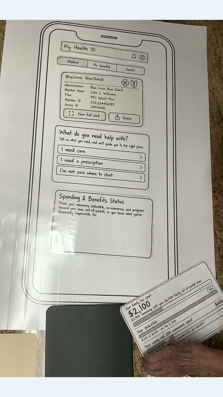
We used paper prototypes to explore how people responded to different ways of organizing their benefits card, care navigation and spending information.
Early paper prototyping
Testing different ways to organize the benefits card, care navigation and spending information before committing to the digital experience.
Early prototype · fictional plan data
Our early work has included
User interviews · Paper prototyping · Employer discovery · Benefits-leader conversations · Usability testing
02 — What surprised us
Early testing challenged some of our assumptions.
Early qualitative observations · not statistically validated
- 01
Care before spending
When people needed help, care navigation mattered more than benefits spending information.
We expected spending information to play a larger role. Instead, participants showed greater interest in help navigating care in the moment they needed it.
- 02
Cost context still mattered
People wanted cost information—even when the starting point was simply their plan copays.
Participants showed enthusiasm for cost information and surprise that more advanced healthcare cost-transparency tools exist. That suggested the first useful experience does not need to solve every pricing problem at once.
- 03
Progress over analytics
They didn't want a spending breakdown. They wanted to know how much was left.
Categorical spending generated little interest. Participants were much more interested in how much remained before their deductible was met, and showed limited understanding of coverage beyond the deductible.
03 — What changed
The prototype became simpler around the questions people actually had.
Early prototype
Current direction
Health Plan
Sarah Mitchell
PPO Select
NSH482917305
GRP7741
Ask about your benefits
Your benefits spending
Sample plan yearYour family has spent
$2,100
$3,900 remaining until your $6,000 family out-of-pocket maximum
Your family deductible
Met$1,500 of $1,500
Met August 3, 2026
What this means for you
You've met your deductible. For covered services with 20% coinsurance, your plan now pays 80% of the allowed cost and you pay 20%.
Other services may have different costs.
Copays and coinsurance paid
$600
Included in your family's $2,100 total
Care navigation moved forward.
Help at the moment of need became more prominent.
Cost became actionable context.
Start with understandable plan information such as copays.
Spending became progress, not analytics.
Prioritize deductible and out-of-pocket progress over categorical spending charts.
04 — What we still need to prove
Early signals shaped the product. A pilot has to test the hypothesis.
- 01
Will employees use the benefits card as a front door to navigation?
- 02
Does putting plan information closer to the moment of need change how employees use their benefits?
- 03
Can those changes ultimately influence avoidable employer spending?
05 — The next test
The next step is a real-world pilot.
Test the experience with participating employees, observe how they use it and evaluate what changes.
01
Configure
Set up the experience around your plan.
02
Launch
Put it in participating employees' hands.
03
Observe
See how members use it.
04
Learn
Evaluate the hypothesis together.
Interested in testing it with us?
Explore a pilot →